INDUSTRY
Building & Construction
Country
St. Helier, Jersey
Year
2025
Channel
Channel started as an electrical business and evolved into a group offering electrics, plumbing, and renewable energy. The work was strong and clients trusted the team—but the brand told a different story. It didn’t show their years of craft, the “one accountable partner” model across trades, or their eco-first approach—so it didn’t resonate with owners or employees, and busy B2B buyers perceived them as just another contractor.
Project Overview
Align who they are, how they work, and how they’re seen—so the owners can stand behind the brand, the team wears it with pride, and professional buyers quickly understand: eco-first, multi-service, single accountability.
Strategic Approach
We started with the foundation: clarity and alignment.
We ran sessions with the owners and team to understand:
The company’s history—from Channel Electrics to Channel Services
How B2B clients really see them
What makes them different from other local contractors
From that work, we defined a clear narrative:
Channel is the dependable, future ready services —electrics, plumbing and renewables, coordinated by one trusted team.
Channel is a Jersey-born business with 20+ years in the market, led by Michael and Ross, delivering electrics, plumbing, and renewables as one coordinated system for professional B2B project teams across Jersey.
Attention of
Michael Gallagher
Timeline
7 Weeks
Services
Product design, Ui/UX, No-Code Development

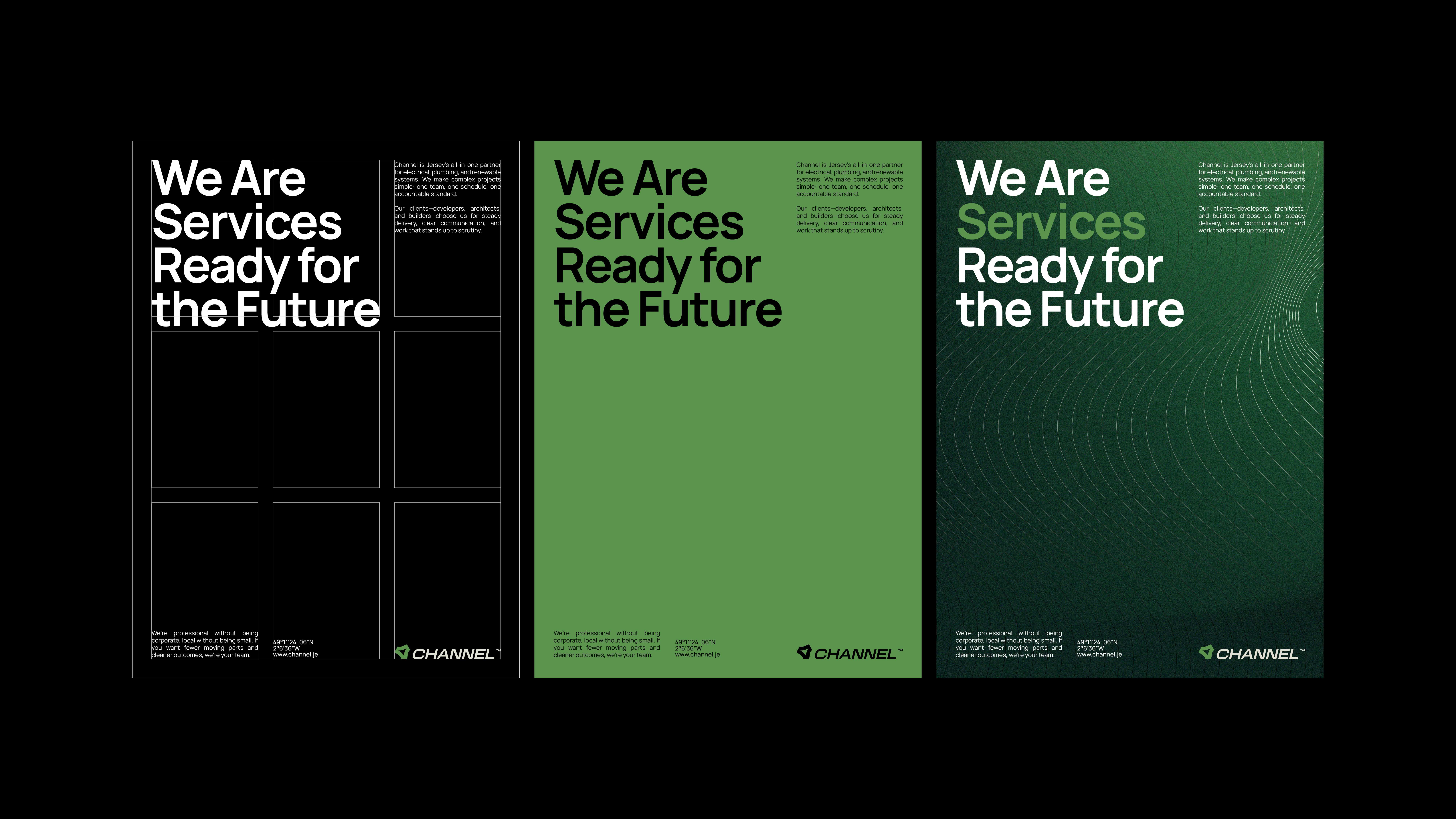
Design Solution
We simplified the name from Channel Services to just Channel — shorter, clearer, and easier to remember. The new slogan, “Future-Ready Services,” keeps the connection to what they do and where they’re heading.
The new mark brings together their three core areas — electrics, plumbing, and renewables — into one simple symbol. It also gives a subtle nod to the Channel Islands, making their integrated approach instantly recognizable.
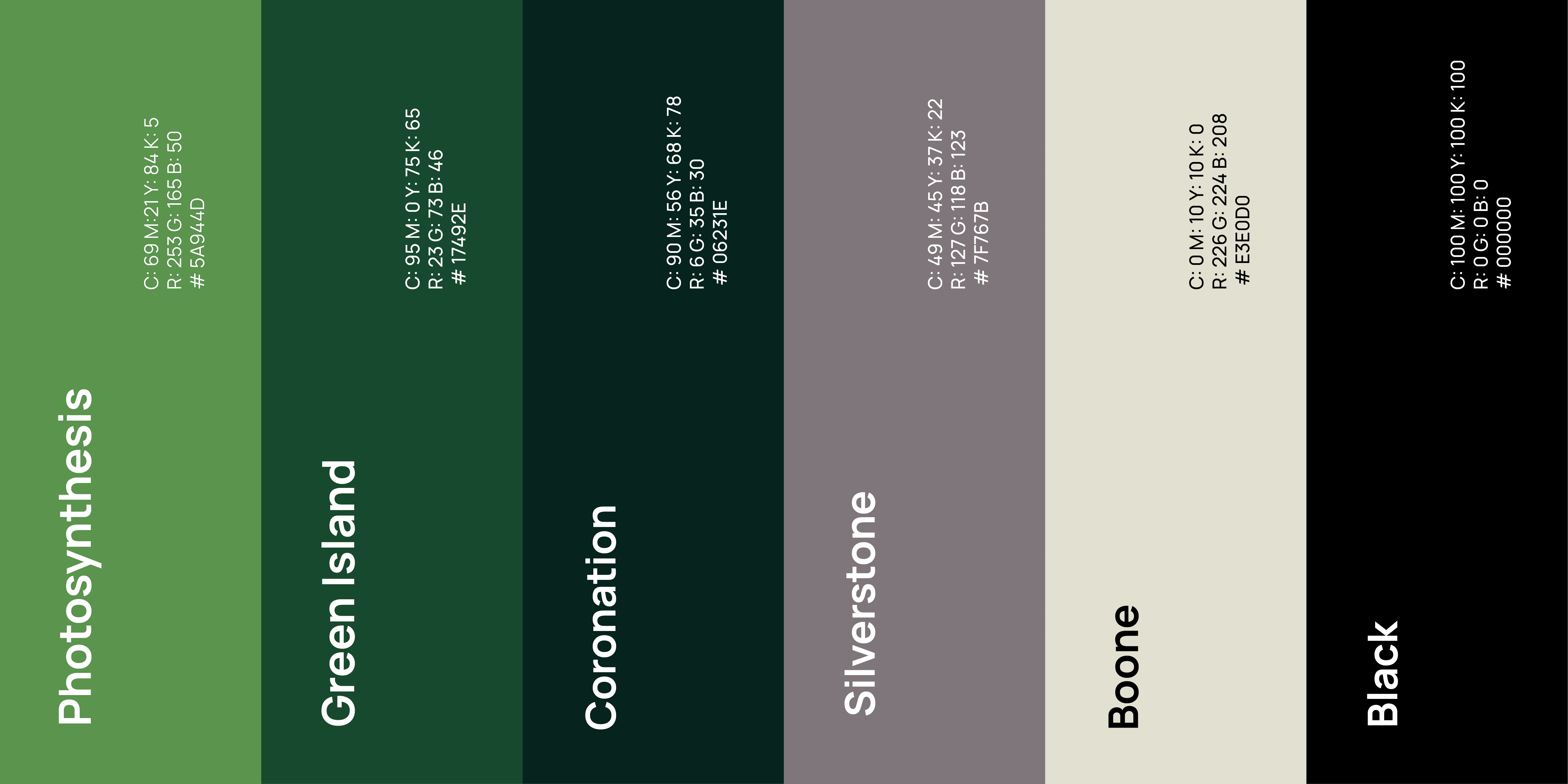
A deep green leads the color palette, grounding the brand in its eco-first mindset. Real on-site photography keeps it authentic, showing the people behind the work and the quality of what they deliver — always with a touch of nature when it fits.
We carried that same sense of unity through every detail: vans proudly share the “one team” message, uniforms are comfortable and worn with pride, the website and social channels tell the same story, and even the stationery is made from recycled materials — a small but real reminder of their commitment.


The Result
Channel now shows up as one brand, with many services, instead of several disconnected identities.
B2B clients understand at a glance what Channel offers and why they’re different
The new visuals bring consistency to vans, uniforms, signage, and digital, reinforcing trust on every interaction
Internally, the team feels more aligned and proud to represent a brand that matches the quality of their work
Channel didn’t just get a new logo. They gained a cohesive, future-ready identity that reflects who they are.